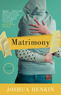
From the first round, a sweet, quirky take. John pushed for this I think, but it didn't pan out. There is a small crack down the heart. I don't think I've ever used a heart on a cover before, but I embraced the concept here:

A youthful approach, a photo split in two:

Another variation on the bird design, but this time with the type doing the work:

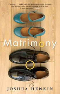
And the final design (photo by Ann Cutting). John eventually hired a photographer to take this image based on a stock photo I found. The photographer did an excellent job. I considered asking John if I could be paid in part by getting the shoes from the shoot.


Gotta say, I prefer the approved comp best. It has that "his and hers" feeling.
ReplyDeleteCongrats on the blog!
I agree. I'm documenting the process for the covers with some of my favorite outtakes, but many times the final is the best/most appropriate.
ReplyDelete