Friday, April 24, 2009

PDA awards

I was lucky enough to get several pieces in the first ever AIGA Philadelphia Design Awards this year. Sean Adams (Adams/ Morioka), Alice Chung (Omnivore), Rick Landesberg (Landesberg Design), Scott Stowell (Open) and Alice Twemlow were judges. Go vote for your favorite now:

http://www.aigapda2008.com


Thanks to Jonathan Sainsbury from Pantheon, Eleen Cheung from W.W. Norton, Counterpoint and JHUP for sending great projects my way!

Thursday, April 23, 2009

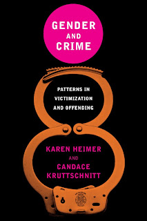
Gender and Crime

A serious subject matter for NYU Press. Just one alternate to show here...I thought the first one really brought "gender" into the cover concept, but instead they opted for a more straightforward approach.


Not sure the idea of a woman's figure translates to the final cover as an immediate association.

Thursday, April 16, 2009

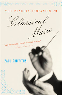
Classical Music

Here's an oldie, but goodie for Penguin. I of course tried a couple directions showing tons of instruments (that was fun sourcing), but I was quite happy that the final featured just the conductor's hands. Simple, but effective. I also used those "hot" colors I like. Georgia first mentioned that term and I realize I use these colors a lot...if only they would get approved more often.


Look at that spine...doesn't every book cover designer love a spine they can really work with? Ah, ornaments.

Friday, April 10, 2009

Human Oddities

Digging in the archives just now, I came across this title from Shoemaker & Hoard (now merged into Counterpoint). This book was ripe with imagery. From Amazon: These nine stories hinge on the damaged contemporary body;battered, conjoined, disfigured by plastic surgery, abandoned, intoxicated, in drag or rendered uninhabitable by obesity, desire or deformity. With freak-show imagery tempered by sympathy, Jablonski conjures outcast protagonists...

Sure, showing disfigured bodies is one thing, but how to do so in a way that is intriguing to a book buyer...and not too off-putting? Well, my first thought was dolls, because they can take on a pretty creepy feel with the right lighting. I also researched famous twins such as Chang and Eng Bunker and the Hilton Twins via the author's notes.

Here is the suggestion of cojoined twins using dolls:


Historical photos (the ornamentation on the first one is supposed to be bizarre and circus-like):


A close up of the body:


And the final using a doll. The close up of the face is disconcerting, the cut arm, and the type is slightly off:

Tuesday, March 31, 2009

Sex, Death & Oysters

An unusual topic, couldn't pass this one up. For Counterpoint, this book chronicles a food writer's experiences with oysters, including history and recipes. The author, Robb Walsh has written many cookbooks on mostly Tex Mex food, so this is a departure.

One alternate comp here, a more refined take on the subject:


And the final design using spot art. I added the detail of oyster forks in the ornamental frame surrounding the subtitle :

Friday, March 27, 2009

a night with AIGA...

The other night I attended an AIGA talk in Philly featuring Roberto de Vicq de Cumptich. It's not often that AIGA features a book cover designer so I was quite happy to go. Already very familiar with Roberto's work, I've long been a admirer, but had an especially good time seeing not only his new work, but also plenty of "shelved" comps...always interesting to see.

No one does type like Roberto. He has an intuitive sensibility about type as image. While some designers limit their typefaces to a few, there is a huge range in Roberto's typography--it is simply beautiful and never appears as an afterthought. And what a relief to see some beautiful work. What happened to beauty? While I think there is a lot of great work today, somehow beauty is too seldom a part of the equation anymore. Modern, engaging, fresh, bold, conceptual, yes, but beautiful...well, not always. Somehow beauty has been relegated to boring.

Roberto's work fills both those categories of being modern, fresh AND beautiful and it was wonderful to see.

Maybe in part because this was my first time being on my own for more than 2 hours since my daughter was born, but attending this talk was a pretty great way to spend an evening.

Feed the Hungry

Jacket for Simon & Schuster. From Amazon: This rambling memoir takes readers from a Virginia plantation to punk-era New York City, with stops in the Bahamas, Brazil, Japan and other alluring destinations.

For the first round of comps, I had the words "lush," "beautiful," and "exotic" in mind. I tried to balance these concepts with the writer's upbringing in Virginia. The first concept uses a recipe card to hold the type:


For this concept, I took silhouettes of various elements from the book and filled them with color (actually a photo beneath, moved around between the objects).


A more traditional approach, beautiful and literary in feel:


Much bolder, touches on the exotic elements in the writing:


I was then asked to work with photos of the author as a young girl and her father. I adapted the recipe card and also brought in some small ornaments to hint at the author's travels:


In the end, they went for a much simpler adaptation:


It has occurred to me after Jonathan's comment that there is some disconnect between the photo on the final cover and the title. This cover went through many revisions (more than what I'm showing) and basically kept getting "simplified." The overall tone of the book shifted too. The final cover doesn't give you any sense of "food" and instead looks like a memoir (with a slightly sad sensibility to it paired with the title). Only the subtitle gives an indication of the author's connection to food...