I was lucky enough to get several pieces in the first ever AIGA Philadelphia Design Awards this year. Sean Adams (Adams/ Morioka), Alice Chung (Omnivore), Rick Landesberg (Landesberg Design), Scott Stowell (Open) and Alice Twemlow were judges. Go vote for your favorite now:
http://www.aigapda2008.com
Thanks to Jonathan Sainsbury from Pantheon, Eleen Cheung from W.W. Norton, Counterpoint and JHUP for sending great projects my way!
Friday, April 24, 2009
Thursday, April 23, 2009
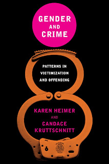
Gender and Crime
A serious subject matter for NYU Press. Just one alternate to show here...I thought the first one really brought "gender" into the cover concept, but instead they opted for a more straightforward approach.
Not sure the idea of a woman's figure translates to the final cover as an immediate association.
Thursday, April 16, 2009
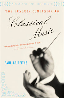
Classical Music
Here's an oldie, but goodie for Penguin. I of course tried a couple directions showing tons of instruments (that was fun sourcing), but I was quite happy that the final featured just the conductor's hands. Simple, but effective. I also used those "hot" colors I like. Georgia first mentioned that term and I realize I use these colors a lot...if only they would get approved more often.
Look at that spine...doesn't every book cover designer love a spine they can really work with? Ah, ornaments.
Friday, April 10, 2009
Human Oddities
Digging in the archives just now, I came across this title from Shoemaker & Hoard (now merged into Counterpoint). This book was ripe with imagery. From Amazon: These nine stories hinge on the damaged contemporary body;battered, conjoined, disfigured by plastic surgery, abandoned, intoxicated, in drag or rendered uninhabitable by obesity, desire or deformity. With freak-show imagery tempered by sympathy, Jablonski conjures outcast protagonists...
Sure, showing disfigured bodies is one thing, but how to do so in a way that is intriguing to a book buyer...and not too off-putting? Well, my first thought was dolls, because they can take on a pretty creepy feel with the right lighting. I also researched famous twins such as Chang and Eng Bunker and the Hilton Twins via the author's notes.
Here is the suggestion of cojoined twins using dolls:
Historical photos (the ornamentation on the first one is supposed to be bizarre and circus-like):
A close up of the body:
And the final using a doll. The close up of the face is disconcerting, the cut arm, and the type is slightly off:
Sure, showing disfigured bodies is one thing, but how to do so in a way that is intriguing to a book buyer...and not too off-putting? Well, my first thought was dolls, because they can take on a pretty creepy feel with the right lighting. I also researched famous twins such as Chang and Eng Bunker and the Hilton Twins via the author's notes.
Here is the suggestion of cojoined twins using dolls:
Historical photos (the ornamentation on the first one is supposed to be bizarre and circus-like):
A close up of the body:
And the final using a doll. The close up of the face is disconcerting, the cut arm, and the type is slightly off:
Subscribe to:
Posts (Atom)