Here are two alternate comps for a Georgetown University Press cover I worked on (same concept, different layouts). The idea here is that the missiles look like flowers / plants growing. I think this may have been too subtle for them.
Friday, February 27, 2009
Wednesday, February 25, 2009
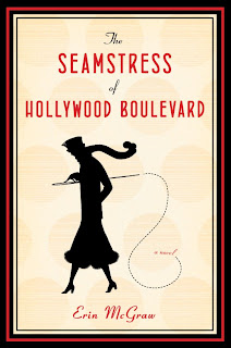
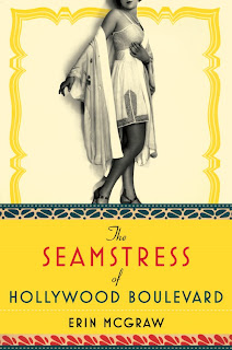
The Seamstress of Hollywood Boulevard
Here is a design that was killed. From Michaela at Houghton. It went to production, but then was changed before printing. The resulting hc cover is lovely (you can look it up on Amazon). Here are a couple of the hardcover comps I initially submitted:
An illustration I tweaked based on an Erte illustration, light in tone and with a definite deco feel:
And a more sophisticated, sultry approach (this is the comp that was originally approved):
An illustration I tweaked based on an Erte illustration, light in tone and with a definite deco feel:
And a more sophisticated, sultry approach (this is the comp that was originally approved):
Monday, February 23, 2009
Blood Kin paperback
I had seen the hardcover for this title and thought it was amazing (by Paul Buckley). When Roseanne Serra sent me the paperback, I have to admit, I was a little intimidated. After getting direction from Roseanne it became clear the paperback was meant to convey a much different tone. At first the direction was to go in the style of Bell Canto and not to have the cover look "grim."
The novel traces events during the overthrow of a president in an unnamed country and centers around three men: the president's chef, barber and portraitist. More difficult than you might imagine since an unnamed country/president means quite a lot of difficulty sourcing images with no sense of place or physical description. I did pick up on a few clues. First off the author is from South Africa and one flower described in the book is the jacaranda. Jacaranda is native to tropical climates, but also is found in Africa. I used this purple flower as line art in many of the comps.
From the first round, icons referencing the 3 men:
A more sweeping, beautiful design (taking a chance here showing a person):
As we went on the direction changed after review in-house. I was told to think "pretty" possibly all-type:
Then I attempted a watercolor treatment (small inset crown and overlaying jacaranda line art):
A more "big book" look with bold type and a reference to place:
Nothing was getting approved and after 6 or so rounds we finally hired the brilliant Tamara Staples. I had a great experience working with her on this shoot. I used my first comp for direction on objects to photograph and we discussed textures, backgrounds, etc. We also added in a lush looking flower (no jacaranda to be found anywhere so a replacement was necessary) and the resulting photograph was perfect. The mood of the image captured the writing beautifully. An earlier type treatment that was liked in-house and the final design (unfortunately the seal had to be added later!):
The novel traces events during the overthrow of a president in an unnamed country and centers around three men: the president's chef, barber and portraitist. More difficult than you might imagine since an unnamed country/president means quite a lot of difficulty sourcing images with no sense of place or physical description. I did pick up on a few clues. First off the author is from South Africa and one flower described in the book is the jacaranda. Jacaranda is native to tropical climates, but also is found in Africa. I used this purple flower as line art in many of the comps.
From the first round, icons referencing the 3 men:
A more sweeping, beautiful design (taking a chance here showing a person):
As we went on the direction changed after review in-house. I was told to think "pretty" possibly all-type:
Then I attempted a watercolor treatment (small inset crown and overlaying jacaranda line art):
A more "big book" look with bold type and a reference to place:
Nothing was getting approved and after 6 or so rounds we finally hired the brilliant Tamara Staples. I had a great experience working with her on this shoot. I used my first comp for direction on objects to photograph and we discussed textures, backgrounds, etc. We also added in a lush looking flower (no jacaranda to be found anywhere so a replacement was necessary) and the resulting photograph was perfect. The mood of the image captured the writing beautifully. An earlier type treatment that was liked in-house and the final design (unfortunately the seal had to be added later!):
Saturday, February 21, 2009
The Error World
From Michaela Sullivan at Houghton, an interesting memoir of a man obsessed with rare stamps. Michaela and I had a good discussion about this before I started designing which I think led to another rarity...a comp with no revisions.
Just one alternate here and then the final design. I think the queen on the stamp gives a sense of place, but the chosen cover conveys it better:
The King
A book of poems assigned by Francine Kass at Norton. The poetry is very intense and deals primarily with motherhood, specifically breastfeeding. The jacket goes to press this month.
The alternate comp I'm showing here uses a photograph. I loved how the splash created looks like a small crown:
And the final design, splatters (milk?) forming the icon of a crown (rorschach-like). I had tried using a similar concept on another title, but it works much better here.
The alternate comp I'm showing here uses a photograph. I loved how the splash created looks like a small crown:
And the final design, splatters (milk?) forming the icon of a crown (rorschach-like). I had tried using a similar concept on another title, but it works much better here.
Friday, February 20, 2009
194X
A fun project for University of Minnesota Press from Daniel Ochsner. This was a 3 color job and the direction was to celebrate the period aesthetic (I was provided with several vintage ads I had to use). “194X” referred to the undetermined date of the war’s end. The book is about the rise of planning in American architectural culture during WW II.
First comp, which I hoped they would pick. I liked the way the type formed a building:
Another comp:
And the chosen one...my last choice.
First comp, which I hoped they would pick. I liked the way the type formed a building:
Another comp:
And the chosen one...my last choice.
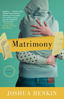
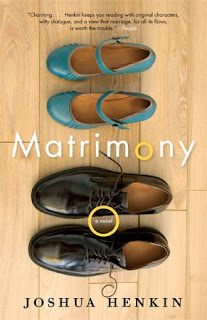
Matrimony
From John Gall at Vintage, a novel about the highs and lows of one couple through college to adulthood. The author was very conservative with the direction of the design, though there was a youthfulness to the characters and the writing. Here are some comps over the long revision:
From the first round, a sweet, quirky take. John pushed for this I think, but it didn't pan out. There is a small crack down the heart. I don't think I've ever used a heart on a cover before, but I embraced the concept here:
A youthful approach, a photo split in two:
Another variation on the bird design, but this time with the type doing the work:
And the final design (photo by Ann Cutting). John eventually hired a photographer to take this image based on a stock photo I found. The photographer did an excellent job. I considered asking John if I could be paid in part by getting the shoes from the shoot.
The First Person
A great collection of stories, this title came to me via Jonathan Sainsbury at Pantheon. Ali Smith is a big name..so I knew what I was getting into. It didn't stop me from trying a few interesting concepts.
First up:
Second comp, that I illustrated. Based directly on a line from her short story, True Short Story, that states: “Franz Kafka says that a short story is a cage in search of a bird.”
and the final comp. I think this one came across as more commercially viable, which I get. The first story revolves around a mysterious box. Enough said.
shelved...
A blog dedicated to the cover that never happened.
Let's be honest, book cover designers....a good portion of our work doesn't get approved. Instead of archiving them away forever, I'll show my lost comps here. A little context, a little subjective commentary, killed comps and the final printed piece = shelved.
Posting may be light at first due to my big design project these days...my daughter. Also still working on the format of the site...more to come.
Subscribe to:
Posts (Atom)