Hope to see everyone there!
Come check out this year's selected covers & books
Wednesday, December 7
6:00–8:00 p.m.
AIGA National Design Center
164 Fifth Avenue (between 21st and 22nd Streets)
New York, NY 10010

Wednesday, November 30, 2011
Wednesday, October 19, 2011
The Color of Night
From Booklist:
“In this sharp blade of a novel, every word is weaponized as Bell stands at the portal to chthonic evil.”
This is a violent, disturbing, and engrossing novel, recalling the savagery of the Manson era. My self imposed direction was to display violence without being too graphic.
Early on in the story, the main character comes upon a dead fawn, and then makes the hide into a fawnskin to wear. For the first comp and the only one not showing a woman, I wanted to show the fawn and the juxtaposition of innocence and brutality.

Many of my other covers do show a 60s stylized version of women, appropriate to the era in which this novel takes place. Knives play a large role in the story, so I've incorporated them throughout.

A slash to evoke violence.

Probably the most literal depiction of the story, and one that was deemed too over the top.

Early on many of the comps use slashes I created on the computer.

Later, I was encouraged to try cutting the photos of women for a more unsettling effect. My studio looked very, very disturbing.

All credit to my art director, John Gall, for pushing this comp to what I think is it's best outcome. I scanned the final image (with slashes) and did quite a bit of Photoshop work to get the slash marks to be realistic, creating more depth and contrast. The final cover:


Thursday, June 23, 2011


Monday, June 13, 2011
Judging 50/50

At my first job out of RISD I used to take out the AIGA annuals on my lunch break and read each one cover to cover. The most intriguing part of the annual, hands down, was always the 50 books/50 covers section and most definitely was an inspiration to start my own book design career. I would see the same names over and over, and I developed a fair amount of hero worship for these book designers.
Fast forward many years. Last month I was at AIGA’s New York office judging the 50 books / 50 covers show. This was not only meaningful to me as a designer, but also because the show itself had been cancelled, then reopened. There has already been much said on the subject—good and bad—so I will forego that debate and highlight instead that there were a decent amount of entries this year. The number was slightly down from the prior year, but in comparison to the total amount entered into the 365 competion, it was a good showing and, in my humble opinion, definitely worth the time, money, and energy for AIGA to continue the legacy of this competition.
AIGA’s Gabriela Mirensky was our coordinator for the judging and the overall process went very smoothly with Chip Kidd as our chair (whose insistence on including 50 of each category I’m happy to report was fulfilled). Joseph Sullivan from the Book Design Review blog and designers Arthur Cherry and Barbara Glauber rounded out the jury and it was a pleasure spending two days with such talented people discussing book design. As Peter Mendelsund noted last year, the criteria for which pieces were selected had more to do with the need for consensus among all 5 judges rather than the any lack of quality among those pieces which were not selected. It was a rare treat to see the work of so many designers I admire all in one room, receiving the recognition each book designer deserves, but only a handful can receive each year.
Finally, I will say that in my mind, the 50/50 competition advances the work of all book designers and gives us a means of showcasing the talent in this field. Yes, we are constantly updating our blogs, twitter, facebook, etc. to get an immediate reaction to our work, but having a large selection at once across all subject matters and all design styles and documented is a good thing.
We are definitely up against many challenges in the coming years regarding the value of our profession. I’m happy there is a place where book designers are celebrated. I’m also hopeful that the annuals and now, the Design Archive, will provide other designers a place to find inspiration (though I’ll go ahead and note here that I miss the printed design annuals for which I don’t think there is a numerical way of evaluating how many times we open and close those pages as opposed to a website). Thanks to everyone who entered and hopefully the entries will increase next year.
Friday, May 13, 2011
Will Write for Food
I've noticed a sharp increase in covers with plates on them. I myself have two in the last couple of years and for the same publisher no less. Here is one of them...
Will Write for Food focuses on the art of food writing. When I received the brief to work on the paperback edition, my first thought was to go a bit more conceptual and playful since the title has a lightheartedness to it. The hardcover was effective, but it showcased the requisite plate which I was hoping to avoid for the paperback.
My first round of comps have more of an illustrative styling to them. Graphic & bold, with a little humor thrown in:

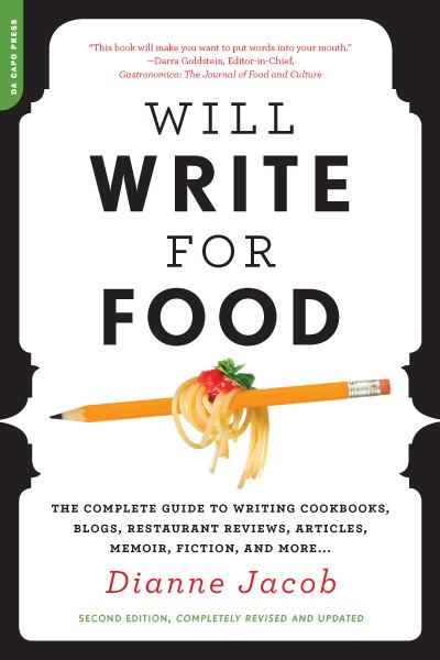


At first the comps were fairly well received. The top comp was the chosen one to revise and pursue. Overall the vector illustration wasn't quite working for people in-house though and maybe it was too busy? However, I was told they liked that the cover looked like a guidebook, but still had an elegant feel to it.
After revising the comp multiple times by incorporating actual photos of the fork and pencil, this cover comp was finally discarded.
So, we began a new round of comps where the direction was more straightforward: not so much about the writing, but all about the food, and elegant food at that, appealing to a general audience of foodies.
Taking this direction, here are two comps that came out of this round:


From this round, the final was chosen. Yes, a plate, but what a great vehicle for holding the type. The plate works every time...

Friday, April 29, 2011
Out of the Vinyl Deeps
At 14 I bought my first record player. It wasn't a good one, but somehow all my lo-fi records sounded perfect at that age. Some years later (ahem), getting to design with vinyl on a book cover is one of those jobs where you can't quite believe your luck.
Here is a brief description from my art director, Rachel Moeller:
A collection of rock criticism of Ellen Willis, a feminist cultural critic famous in the 60s and 70s. While the cover can definitely evoke the era, we'd like it to appeal to a mainstream audience that loves rock and appreciates that vinyl culture is alive and well today.
To update the look, I chose bright colors to even out the "vintage" subject matter. The first comp uses repetitive records to create a pattern, while the inset blue pen mimics the record needle, a nod to Ellen Willis.

The second comp, and the one that went to press is a bit more straightforward, showing a photo of a record and the colorful spines of the record covers. The type followed the form of the photo.

A highlight of this cover was setting the quotes on the back. Hey, wasn't I just 14 at a Bikini Kill show...?

Tuesday, March 29, 2011
AIGA PDA
Happy to hear the following covers made it into the AIGA Philadelphia Design Awards. Work is from the past two years. Looking forward to the show in June!


Thursday, March 3, 2011
50/50
If you appreciate excellent book design, please consider signing this petition to save AIGA's 50 books/50 covers:
http://save5050.com/petition.html
To see 2009's inspiring work, check out this link:
http://designarchives.aiga.org/#/entries/%2Bcollections%3A%2250%20Books%2F50%20Covers%20of%202009%22/_/grid/relevance/asc/0/48/90
http://save5050.com/petition.html
To see 2009's inspiring work, check out this link:
http://designarchives.aiga.org/#/entries/%2Bcollections%3A%2250%20Books%2F50%20Covers%20of%202009%22/_/grid/relevance/asc/0/48/90
Sunday, February 6, 2011
Dead Neon
It's always refreshing to get a title that breaks the mold of the typical genre of books I get. Dead Neon is a subject matter I rarely work on, science fiction writing. I was hooked with the first story and read the entire manuscript before sketching. The first concept that came to mind was a gas mask since many of the stories have an apocalyptic bent. The idea was to create the image out of Las Vegas icons. So I set out about the tedious task using poker chips, dice, playing cards and of course, the iconic Las Vegas sign.


Once I had this comp done I hit a wall. I had no idea where to go next since this one felt so spot on, but of course, 3 comps is what you have to submit so I wracked my brain searching for more concepts. Las Vegas burning, Las Vegas sinking, Las Vegas desolate and deserted...check:


I used a mix of vintage imagery, clip art and stock photos to create the collages used on these two comps. I had a fun time working up these pieces of art for the comps. Kind of an industrial/human merging perspective of the future:


The final design is shown below. Glad to see my first idea was my best. Thanks to Kathleen Szawiola, my art director at University of Nevada Press, who delivered my fastest approval ever in a mere 8 hours (including author approval).

Subscribe to:
Posts (Atom)