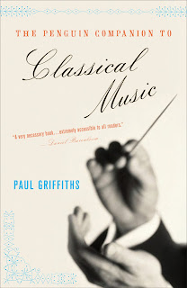
Here's an oldie, but
goodie for Penguin. I of course tried a couple directions showing tons of instruments (that was fun sourcing), but I was quite happy that the final featured just the conductor's hands. Simple, but effective. I also used those "hot" colors I like.
Georgia first mentioned that term and I realize I use these colors a lot...if only they would get approved more often.


Look at that spine...doesn't every book cover designer love a spine they can really work with? Ah, ornaments.


3 comments:
it's so perty.
I like how they allow you to place that penguin logo just about anywhere you like...
That's a MEGA-SPINE. I like that you chose a compressed sans for the spine and just accented it with the script from the cover as a design element. And obviously, I love how you broke the color scheme from the cover into that Penguin orange.
I agree with Ian... that spine is to die for (I think I see a large, orange butterfly). The black cover is elegant and beautiful, but I nearly prefer the salmon one with the instruments sprinkled about. But then that wouldn't mesh with the spine nearly as well I don't think.
This came out beautifully, the spine is really great, i like the salmon one too but this conveys the seriousness one expects of a Classical Music guide.
Post a Comment