Friday, May 13, 2011

Will Write for Food


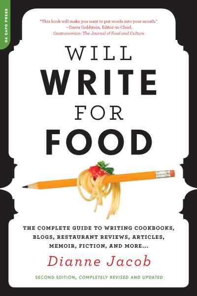
I've noticed a sharp increase in covers with plates on them. I myself have two in the last couple of years and for the same publisher no less. Here is one of them...

Will Write for Food focuses on the art of food writing. When I received the brief to work on the paperback edition, my first thought was to go a bit more conceptual and playful since the title has a lightheartedness to it. The hardcover was effective, but it showcased the requisite plate which I was hoping to avoid for the paperback.

My first round of comps have more of an illustrative styling to them. Graphic & bold, with a little humor thrown in:



At first the comps were fairly well received. The top comp was the chosen one to revise and pursue. Overall the vector illustration wasn't quite working for people in-house though and maybe it was too busy? However, I was told they liked that the cover looked like a guidebook, but still had an elegant feel to it.

After revising the comp multiple times by incorporating actual photos of the fork and pencil, this cover comp was finally discarded.

So, we began a new round of comps where the direction was more straightforward: not so much about the writing, but all about the food, and elegant food at that, appealing to a general audience of foodies.

Taking this direction, here are two comps that came out of this round:


From this round, the final was chosen. Yes, a plate, but what a great vehicle for holding the type. The plate works every time...


Friday, April 29, 2011

Out of the Vinyl Deeps

At 14 I bought my first record player. It wasn't a good one, but somehow all my lo-fi records sounded perfect at that age. Some years later (ahem), getting to design with vinyl on a book cover is one of those jobs where you can't quite believe your luck.

Here is a brief description from my art director, Rachel Moeller:

A collection of rock criticism of Ellen Willis, a feminist cultural critic famous in the 60s and 70s. While the cover can definitely evoke the era, we'd like it to appeal to a mainstream audience that loves rock and appreciates that vinyl culture is alive and well today.

To update the look, I chose bright colors to even out the "vintage" subject matter. The first comp uses repetitive records to create a pattern, while the inset blue pen mimics the record needle, a nod to Ellen Willis.


The second comp, and the one that went to press is a bit more straightforward, showing a photo of a record and the colorful spines of the record covers. The type followed the form of the photo.


A highlight of this cover was setting the quotes on the back. Hey, wasn't I just 14 at a Bikini Kill show...?

Tuesday, March 29, 2011

AIGA PDA


Happy to hear the following covers made it into the AIGA Philadelphia Design Awards. Work is from the past two years. Looking forward to the show in June!


Thursday, March 3, 2011

50/50

If you appreciate excellent book design, please consider signing this petition to save AIGA's 50 books/50 covers:

http://save5050.com/petition.html

To see 2009's inspiring work, check out this link:

http://designarchives.aiga.org/#/entries/%2Bcollections%3A%2250%20Books%2F50%20Covers%20of%202009%22/_/grid/relevance/asc/0/48/90

Sunday, February 6, 2011

Dead Neon


It's always refreshing to get a title that breaks the mold of the typical genre of books I get. Dead Neon is a subject matter I rarely work on, science fiction writing. I was hooked with the first story and read the entire manuscript before sketching. The first concept that came to mind was a gas mask since many of the stories have an apocalyptic bent. The idea was to create the image out of Las Vegas icons. So I set out about the tedious task using poker chips, dice, playing cards and of course, the iconic Las Vegas sign.


Once I had this comp done I hit a wall. I had no idea where to go next since this one felt so spot on, but of course, 3 comps is what you have to submit so I wracked my brain searching for more concepts. Las Vegas burning, Las Vegas sinking, Las Vegas desolate and deserted...check:


I used a mix of vintage imagery, clip art and stock photos to create the collages used on these two comps. I had a fun time working up these pieces of art for the comps. Kind of an industrial/human merging perspective of the future:


The final design is shown below. Glad to see my first idea was my best. Thanks to Kathleen Szawiola, my art director at University of Nevada Press, who delivered my fastest approval ever in a mere 8 hours (including author approval).


Friday, September 17, 2010

If I Loved You, I Would Tell You This


Many times I receive a manuscript, read it through and just hope I can do the writing justice with a cover design. This is the case with Robin Black's beautiful If I Loved You, I Would Tell You This. As with all short story collections, the difficulty lies in finding imagery that can represent the tone of all the stories.

From the Random House website:

"Brilliant, hopeful, and fearlessly honest, If I Loved You, I Would Tell You This illuminates the truths of human relationships, truths we come to recognize in these characters and in ourselves."

--------

The title story is where I originally began. It centers on a woman who is dying of cancer addressing her neighbour, who wants to erect a fence that blocks her driveway. The fence became a visual icon for me in the first round of comps:


The second set of imagery I used was paint strokes, inspired by the story, Immortalizing John Parker. The main character, who is a painter, reflects on her own life while painting a portrait of an aging Alzheimer's patient.


The painterly feel of the comps was what I was asked to concentrate on and from there a series of painted comps was submitted for review. First warm, then cooler colors...


Towards the end, the focus shifted back to an earlier comp with the 9 paint strokes. From there, we adjusted the background color and the final jacket was complete. Seen below is the front cover, spine and back:


A small aside: Initially I used 9 paint strokes because the manuscript I received over a year ago had 9 stories. It wasn't until I showed up for Robin's book reading at Bryn Mawr College that I realized the book had 10 stories.

Friday, July 23, 2010

Connected


hello there, apologies for the gap in posting.

First post up for the summer is Connected. This book came to me from Julianna Lee at Little Brown. A interesting project since I already owned the hardcover, bought in part because of how much I liked the hc jacket (designed by Julianna). The direction was to take an entirely different approach than the jacket....maybe something closer to this cover I did many years ago.

Here is a quick summary from Amazon:

Scientists Christakis and Fowler present compelling evidence for our profound influence on one another's tastes, health, wealth, happiness, beliefs, even weight, as they explain how social networks form and how they operate.

My first idea was to form the letters out of groups of people. I spent an inordinate amount of time placing these silhouettes. This was a favorite concept on my part, but was deemed too difficult to read because of the title not reading as one word.


On this comp, I graphically connected the letters and layered them over a crowd of people:


The final cover is a literal interpretation, but bold & iconic. Small figures with an overlying grid showing the multiple connections. Printed a bright orange with the gray printing metallic. A fun project to work on...